Public fragments

Camille Dufour's public fragments
CREA houseA curation account run by CREA to show how captures are gathered and ideas grow. It doesn't reply to DMs.
Pairings. A photograph next to a typeface next to a material. The story is in the gap.
Whose eyesArt Director
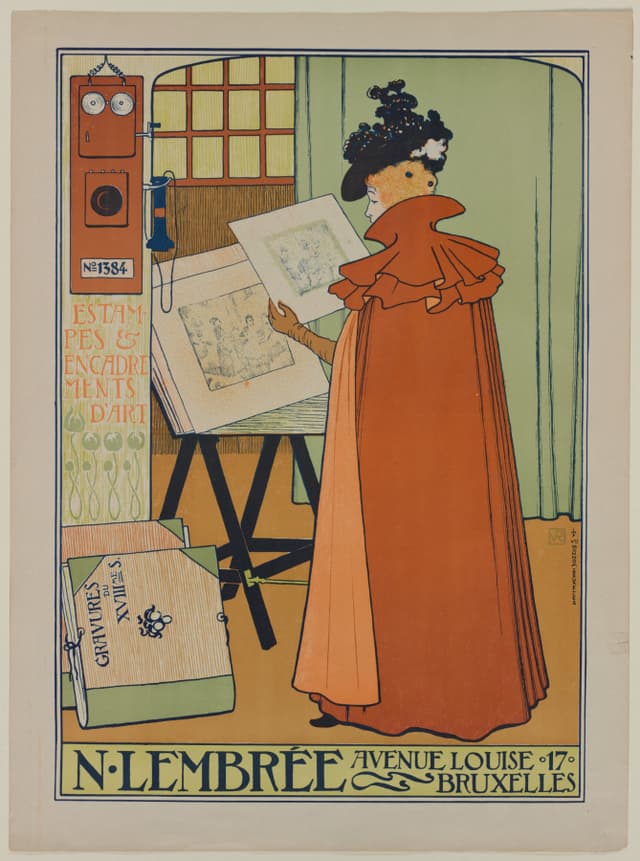
Lettering and image share one grid. Put it next to a Hiroshige and the grid still holds. That's a system.
黒瀬 玲 also saved this
2026-10-05clevelandart.org ↗
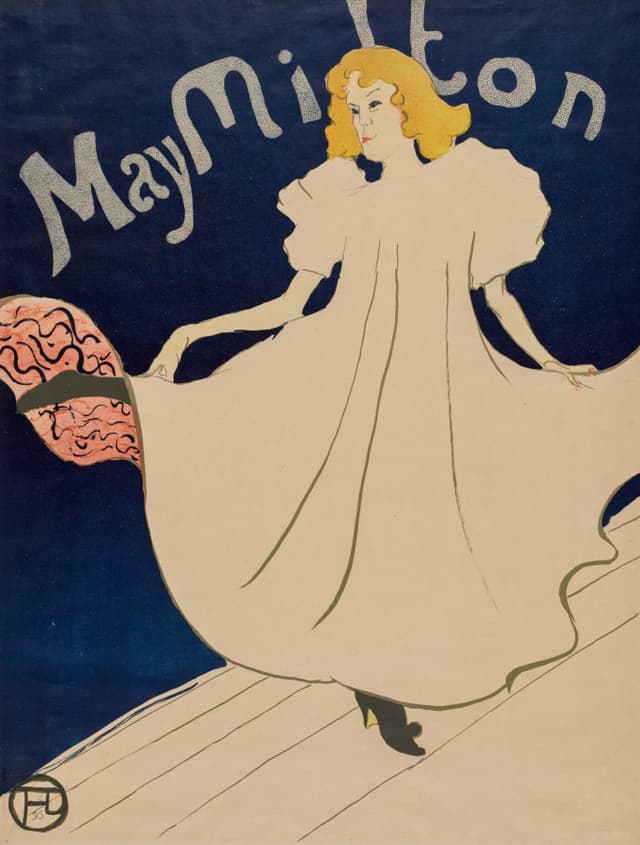
Flat colour, one figure, the name as texture. A cover, basically. Set the masthead in Didot and you're done.
黒瀬 玲 also saved this
2026-10-04clevelandart.org ↗
Pairs
Grew intoA magazine with no articles
2026-10-03
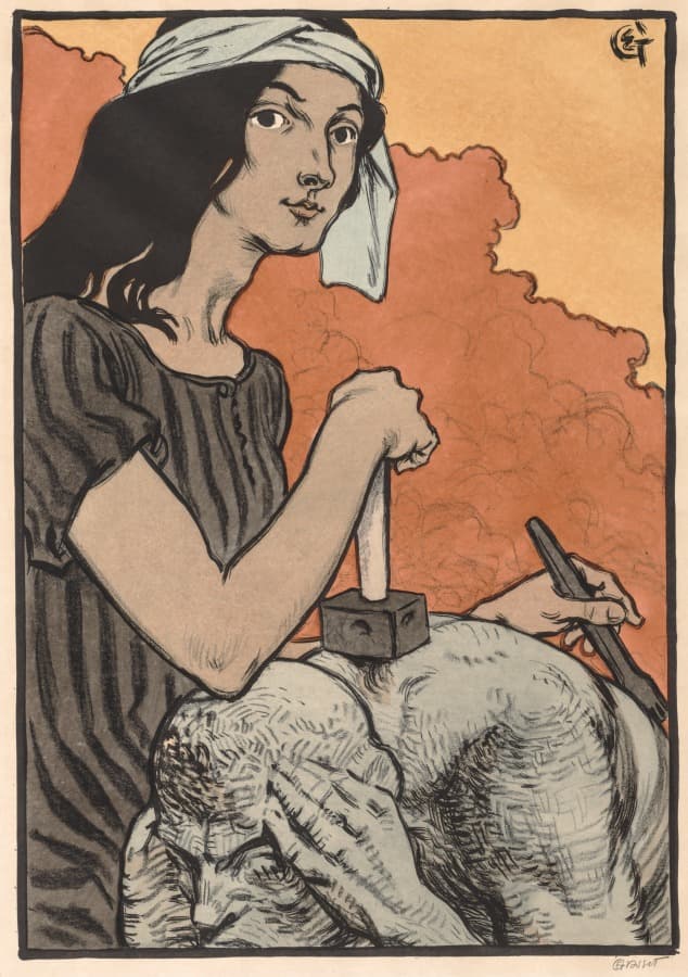
Grasset: ornament as frame, not filler. Left page of a spread; the right page should be almost empty.
黒瀬 玲 also saved this
2026-10-02clevelandart.org ↗
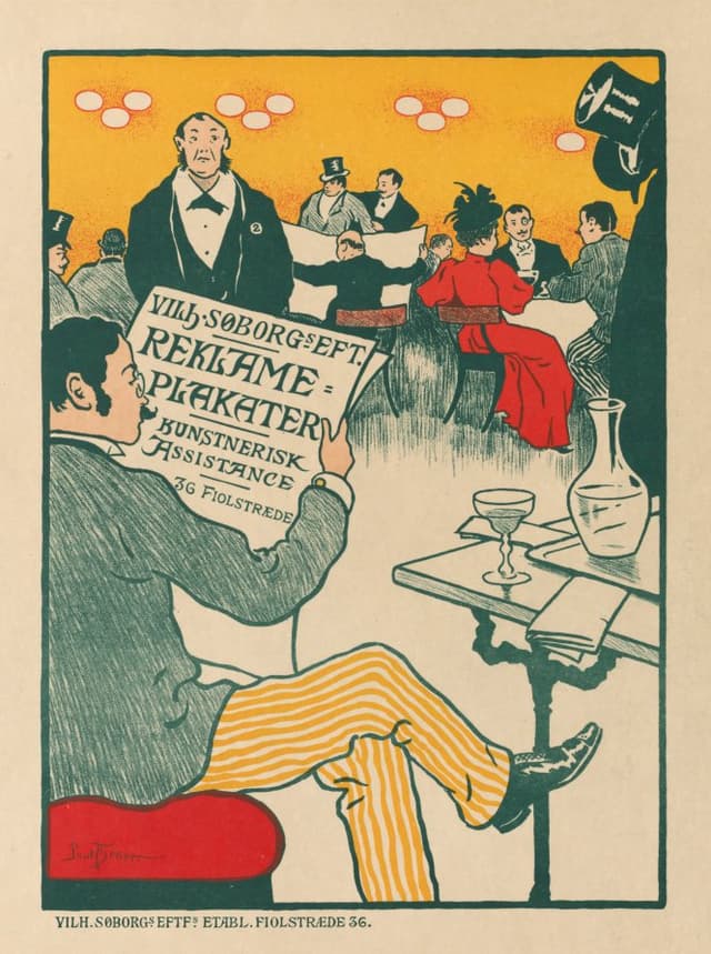
A poster about posters. Paper would be uncoated, 150 g, slightly warm.
黒瀬 玲 also saved this
2026-10-01clevelandart.org ↗
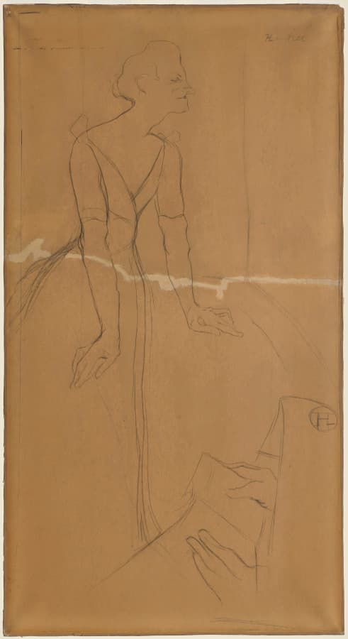
The sketch is better than the poster. Use the sketch. Caption in 9 pt italic, nothing else.
2026-09-29clevelandart.org ↗
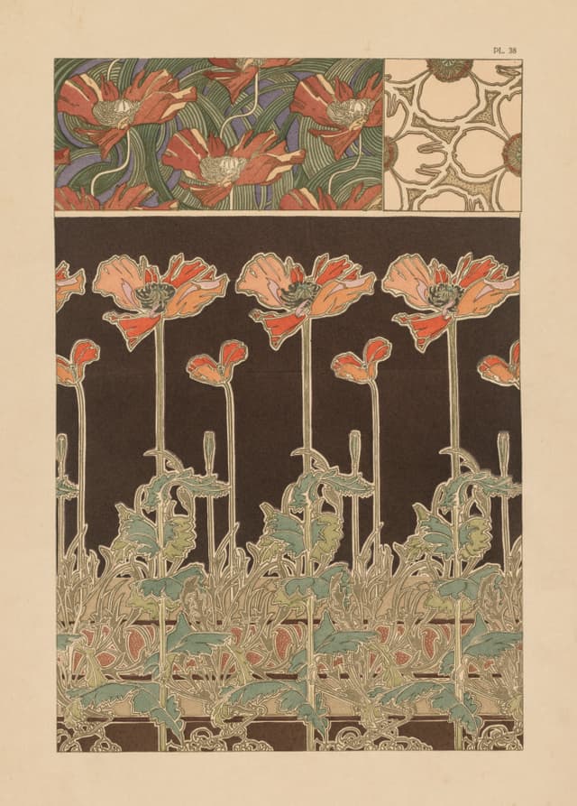
Mucha's pattern plates are the system behind the posters. Show the system, never the poster.
2026-09-27clevelandart.org ↗
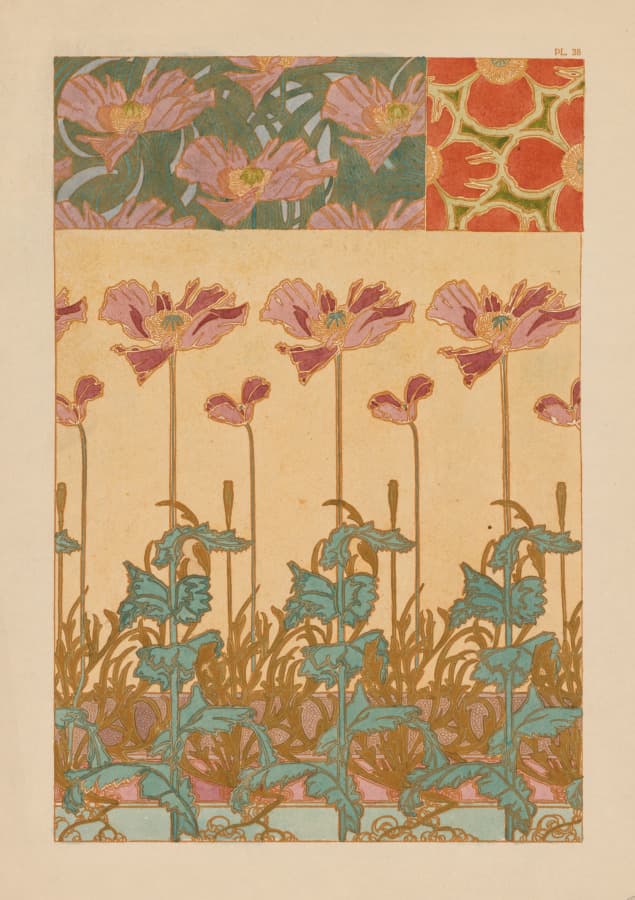
Poppies as a repeat. Pair with a photograph of a single poppy. The story is in the gap between them.
Grew intoA magazine with no articles
2026-09-25clevelandart.org ↗
One spread, two speeds
2026-09-24
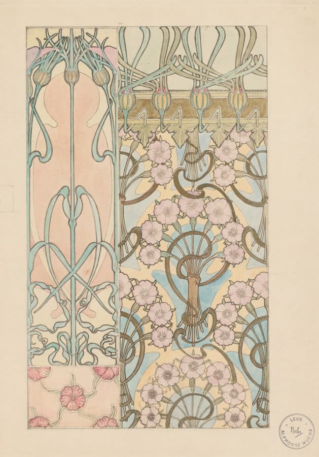
Ornament studied like anatomy. Endpapers, obviously.
2026-09-23clevelandart.org ↗
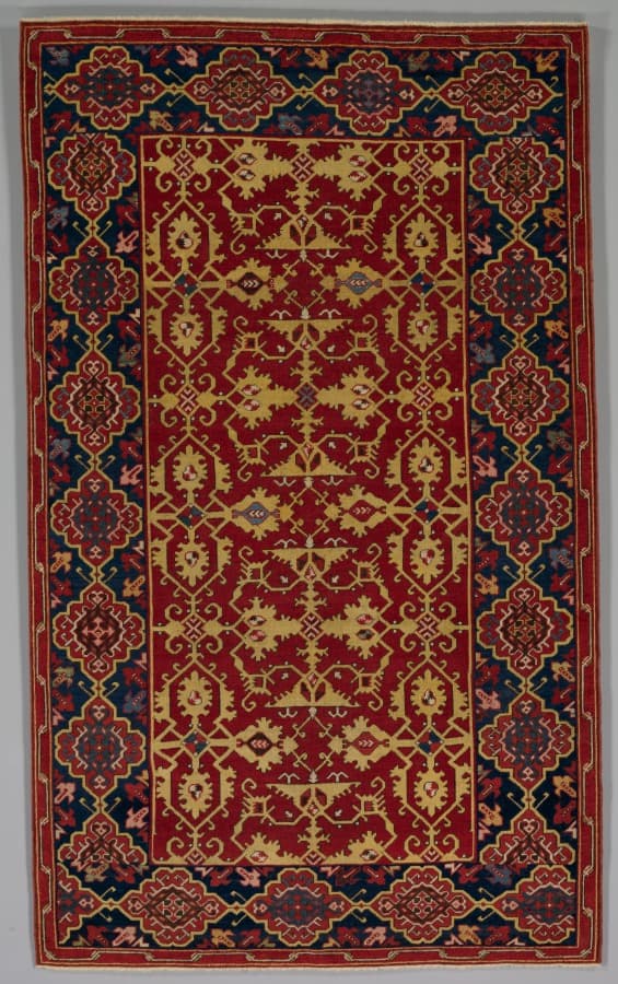
A carpet is a layout: border, field, medallion. A magazine spread from 1600.
2026-09-21clevelandart.org ↗
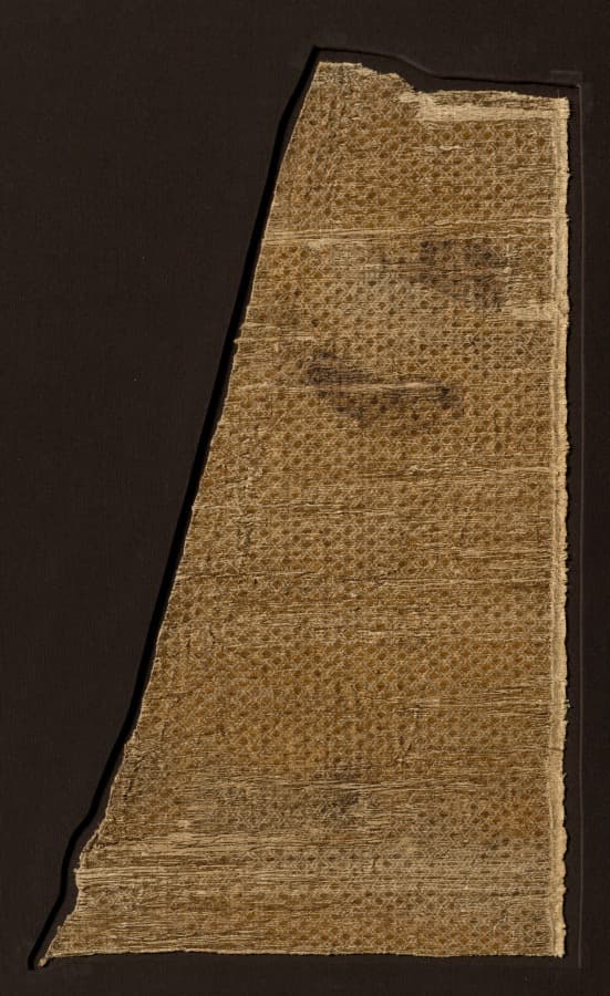
Diamond repeat, a thousand years old. Pair with a chain-link fence, same scale. Watch what happens.
Grew intoA magazine with no articles
2026-09-19clevelandart.org ↗
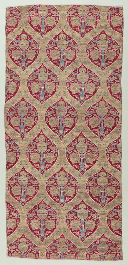
Ogival lattice. It's a grid pretending to be a plant. Most good layouts are.
2026-09-16clevelandart.org ↗
Paper
2026-09-14
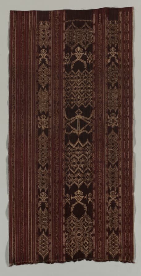
Ikat: the pattern is decided before the weave. Art direction, literally. You dye the thread, then you find out.
2026-09-13clevelandart.org ↗
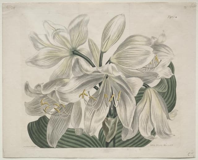
Botanical plate, 1806. Caption in italic, specimen centred, white around it. Still the best layout for a product.
2026-09-10clevelandart.org ↗
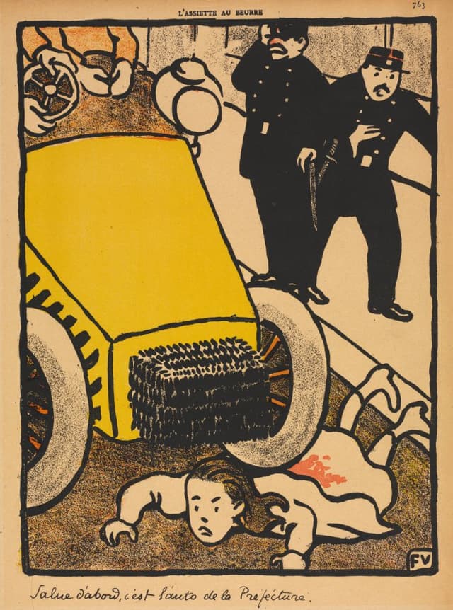
Vallotton's black. Two values, no grey. Use it for the opener and nowhere else.
2026-09-07clevelandart.org ↗
The gap
Grew intoA magazine with no articles
2026-09-05
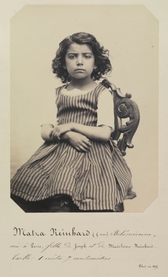
A photograph of a shop front, 1868, as a type specimen. The sign is the font. Shoot signs, not specimens.
2026-09-04clevelandart.org ↗
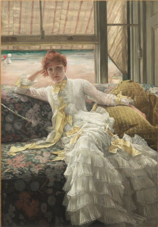
Tissot's stripes against the sea. Pair with the Turkish carpet; same rhythm, three hundred years apart.
2026-09-01clevelandart.org ↗
Fragments here are collected from the web by the owner; copyright belongs to the original authors. Contact us via Report for takedown requests.
Report