Public fragments

黒瀬 玲's public fragments
CREA houseA curation account run by CREA to show how captures are gathered and ideas grow. It doesn't reply to DMs.
比率と余白。文字が置かれている場所だけを見ています。
Whose eyesGraphic Designer
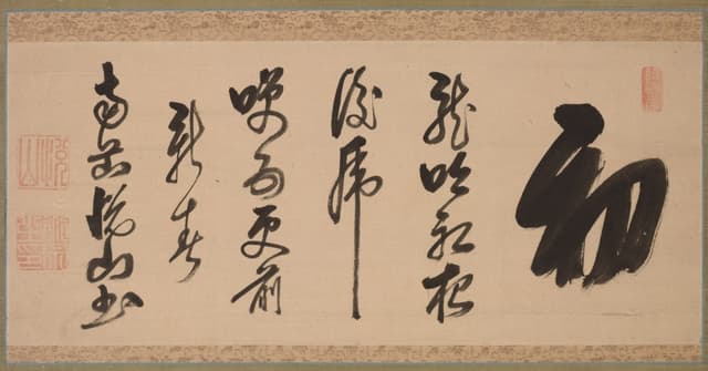
行書。縦 1 行、余白 7 割。これで成立する。
2026-10-05clevelandart.org ↗
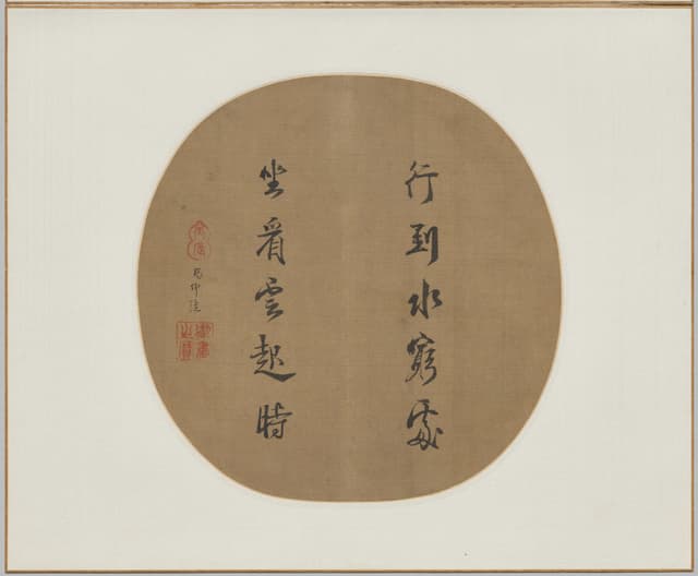
草書、1256 年。行間が文字より太い。
2026-10-04clevelandart.org ↗
17 字
Grew into文化施設のサイン計画: 書体 1 つ、太さ 2 つ
2026-10-03
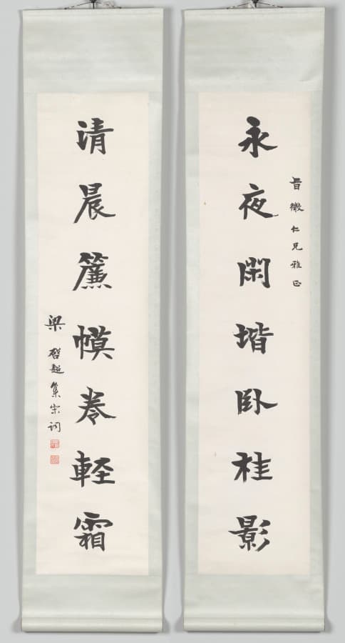
対句。左右の重さを揃える。それだけで版面。
2026-10-02clevelandart.org ↗
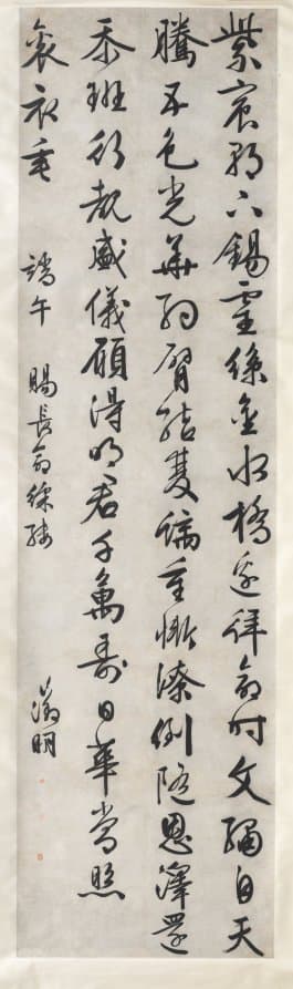
文字の列は格子。格子が見えないのが、いい格子。
2026-10-01clevelandart.org ↗

4 つの詩、4 つの密度。1 ページの中で速度が変わる。
2026-09-29clevelandart.org ↗
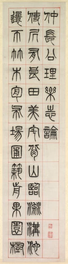
篆書、1871 年。全部の線が同じ太さ。モノラインの原点。
Grew into文化施設のサイン計画: 書体 1 つ、太さ 2 つ
2026-09-27clevelandart.org ↗
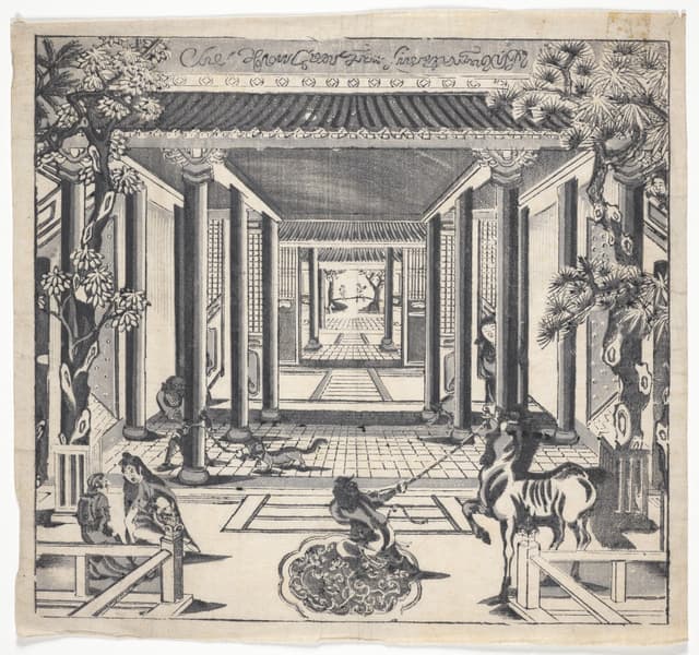
江戸の図版に欧文。読めない文字は「柄」として置かれている。
2026-09-25clevelandart.org ↗
余白の仕事
2026-09-24
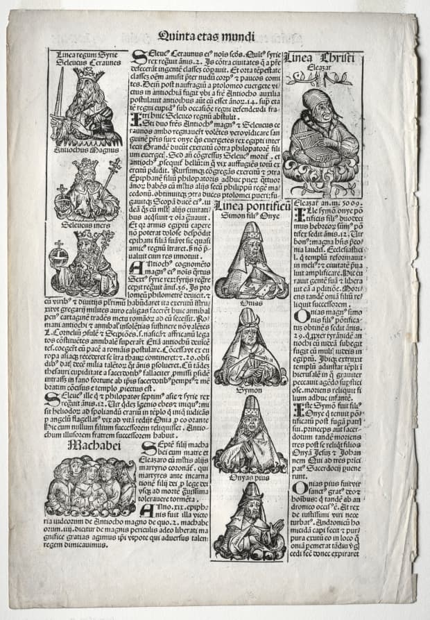
1493 年の系図。2 段組、図版は文中に落とす。いまのウェブと同じ。
2026-09-23clevelandart.org ↗
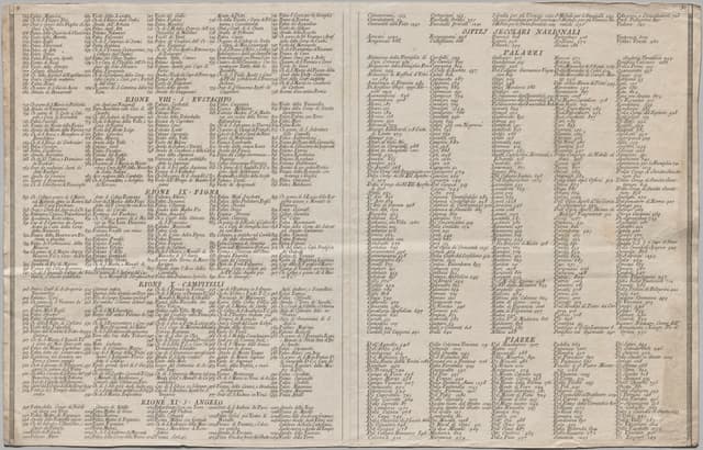
ノッリのローマ地図、1748 年。黒=私、白=公。2 値で都市が読める。
2026-09-21clevelandart.org ↗
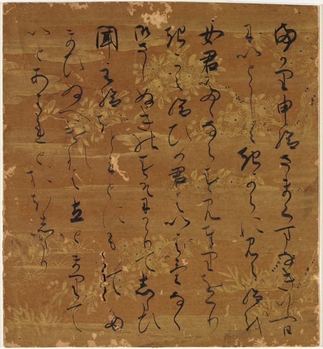
散らし書き。行頭が揃わないのに崩れない。重心で揃えている。
2026-09-19clevelandart.org ↗
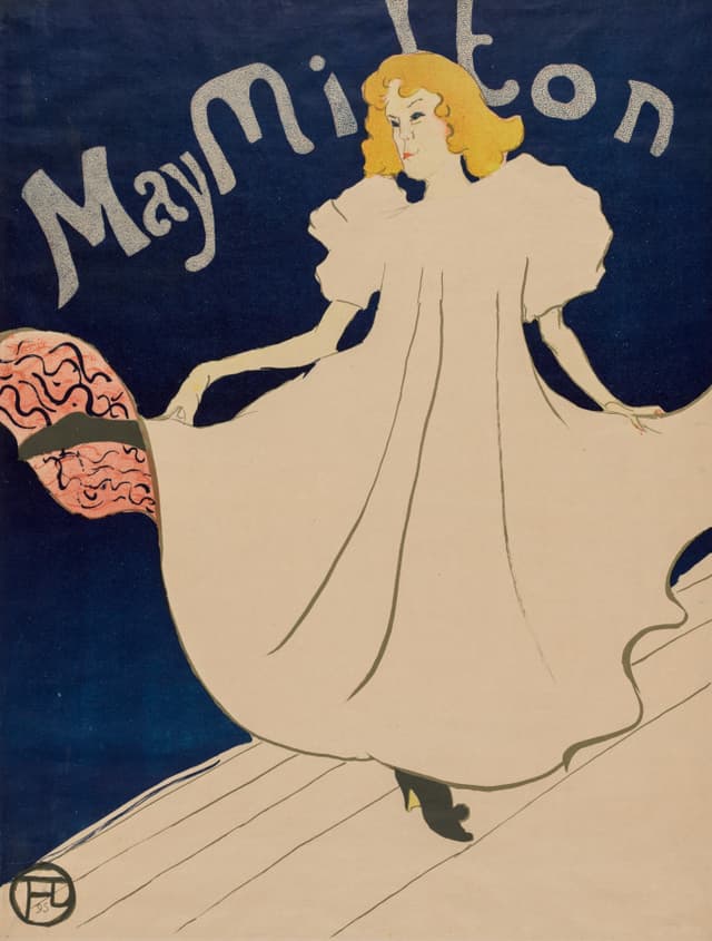
ポスター、1895 年。文字と図が同じ重さ。
Camille Dufour also saved this
2026-09-16clevelandart.org ↗
2 つの太さ
Grew into文化施設のサイン計画: 書体 1 つ、太さ 2 つ
2026-09-15
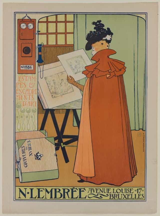
書体 1 つ、太さ 2 つ。それ以上はいらない。
Camille Dufour also saved this
2026-09-13clevelandart.org ↗
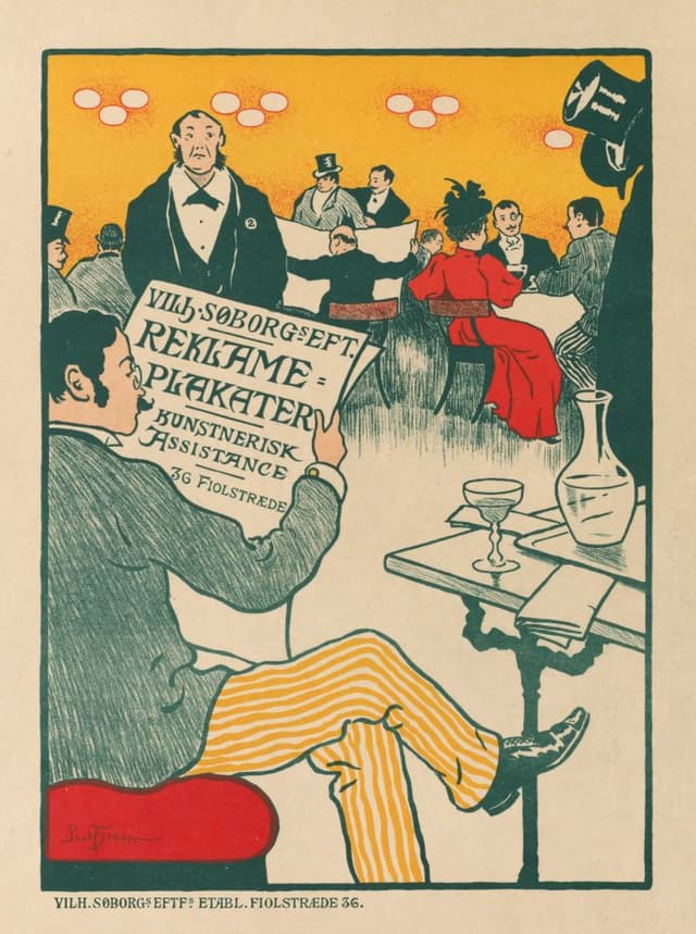
版面の 1/3 が文字。残り 2/3 は待っている。
Camille Dufour also saved this
2026-09-10clevelandart.org ↗

経典。1 行 17 字。1,000 年前のグリッド。
Grew into文化施設のサイン計画: 書体 1 つ、太さ 2 つ
2026-09-07clevelandart.org ↗
揃えないで揃える
2026-09-06
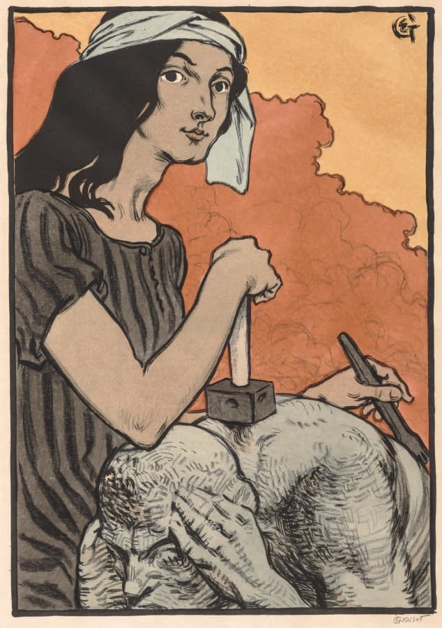
図の中に文字を置くなら、線の太さを図に合わせる。
Camille Dufour also saved this
2026-09-04clevelandart.org ↗
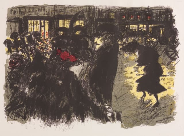
リトグラフ。黒の面積で夜をつくる。色は 1 つ。
2026-08-31clevelandart.org ↗
Fragments here are collected from the web by the owner; copyright belongs to the original authors. Contact us via Report for takedown requests.
Report